Entertainment
Web
Design Challenge

Netflix is best known for providing outstanding and unparalleled video entertainment services. And it has taken entertainment to another level with its interactive, up-to-date, and user-friendly platform.
As a user, I have nothing to complain about Netflix's great content, but discovering them is not ideal for everyone.
In this design challenge, I focused on improving the navigating experience for current users who are sometimes running out of ideas or a personal watch list.
Netflix is full of great content, but, what if you still don’t know what to pick?
01. What is more important to the users?
Started with desktop research, I want to understand other user's primary needs for streaming service.
As "Ease of Use" is a major determining factor for streaming services, I started to find related user reviews. Then, I categorized the findings into the needs of the pyramid to prioritize a design direction:

I decided to continue focusing on the problem related to content navigation in the challenge. This is one of the most important aspects of Netflix, which has already attracted users through peculiar content. But, before users start to enjoying watching, there is one more crucial step - discover it.
PRIMARY NEED
The way content was served up and discovered was in fact, more important that the content itself.
02. How do you currently discover a show?
A quick online survey let me learned an initial experience of navigating on Netflix:
SPOT OF DISSATISFACTION
Users are having difficulty making decisions
03. Why is it important?
To further evaluate the potential business impact of the problem, I found some interesting big data online:
https://www.businessofapps.com/data/netflix-statistics/
Users love Netflix because of the high-quality content, but Netflix is not the only choice among the competitive streaming services market. Users spent almost half of their time on Netflix discovering the content rather than watching it with limited time.
IMPACT ON RETENTION RATE DECREASING
Why would users stay on Netflix if they can't find a show quickly?
With user interviews, I obtained more detailed insight into this problem:

What's the problem of content discovery?
Users spend longer time on browsing instead of enjoying
+
Users find it difficult to choose a show relevant to their own interest
+
Users need to seek outside recommendations to make decisions.
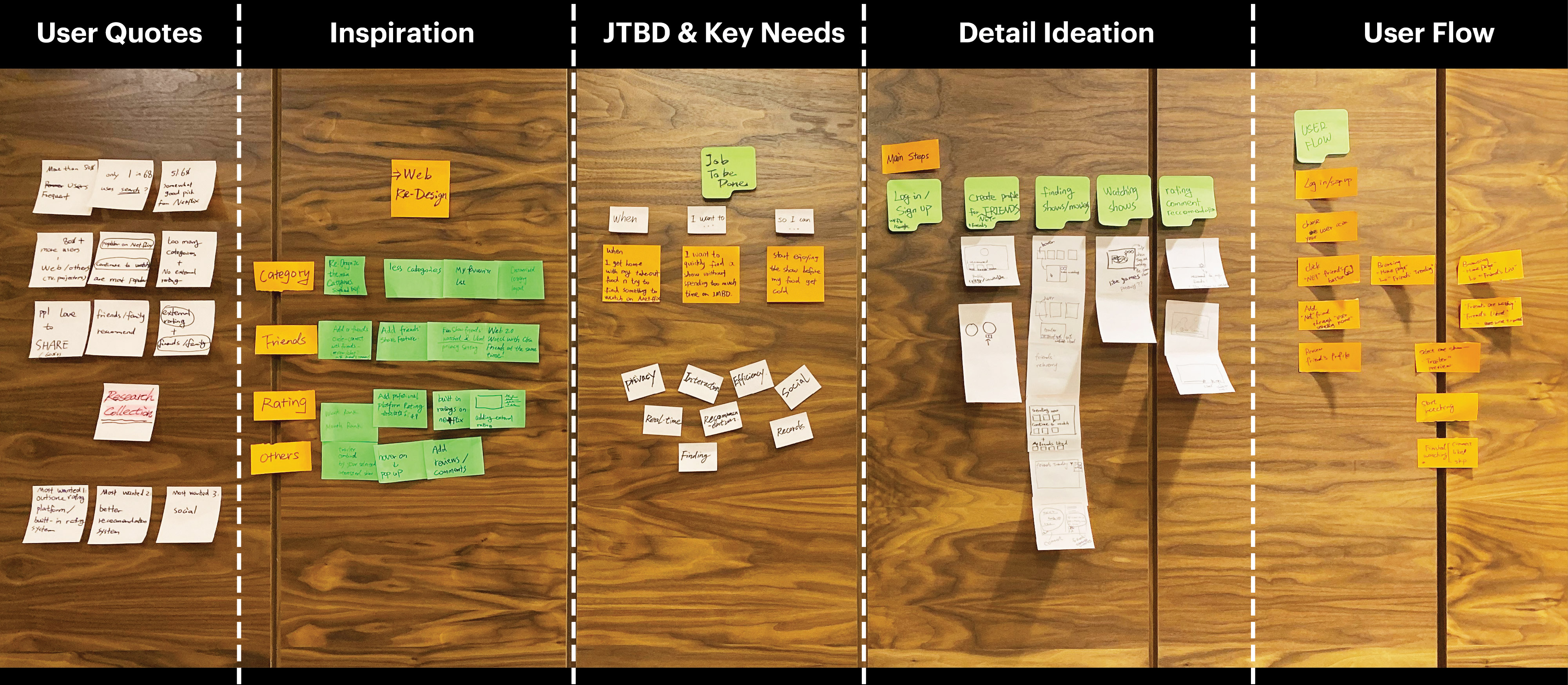
During the user research stage, I pictured the detailed journey and came up with a set of underserved needs to keep in mind during design. And setting up the goal of design as simplify the steps users need to take:


The goal is to find an alternative way that enables users:
Find a high quality show relavent to their interest
+
Find a show faster within limited entertainment period
+
Utilize Netflix build-in reference without relying on going outside for suggesions
Narrow down on more targeted users group
As Netflix has a very board range of users, focusing on more targeted user groups behavior helped me be more specific on moving forward with ideas:
Brainstorm time
I assumed that users would enjoy or be interested in friends' recommended shows because they share similar interests and lifestyles. After a quick brainstorm session, I found a digitalized "Friend's Recommendation" that might align with the user's JTBD:
"When I got off from work with a noodle delivered to home, I wanted to quickly find a good show so I can enjoy it before noodle gets cold...."

How might we digitalize the off-line friend's recommendation experience?

How to get recommendation?
Chat?
Build-in cateory?
How to find it on Netflix?
Browsing category?
Friend's ranking?
Separated entrancy?
Watch together with friends?
How to share with others?
Liked collection?
Score & leave review?
Instant message to share?
Notification system?
Possible features
I explored more possible features and organized them under major steps, then quickly arranged them in a prioritization matrix to evaluate.


Defining MVP & balancing social and privacy
Many ideas seem good and can make Netflix more sociable if I need more input from the marketing and data team in a real product development context. As this is a design challenge, I set up the criteria below to prioritize the MVP features.
3 Questions to answer
2 Hypothesis to begin with
Product feature decisions
At the end of day, users primary goal is to pick a good show quickly.
NetFriends helps users to spend less time on choosing and more time enjoying the show. A friend's recommendation as a build-in reference provides users with a simplified method to evaluate a show in line with their own interests.

Add friends
Browse friend's liked shows
Enjoy & Share
Key Feature 1 - NetFriends Trending
Add this new category on home page for fast discovery
Key Feature 2 - NetFriends Profile
Create a separate entrance to this section and allow users to manage friends and view individual friend's liked shows
Key Feature 3 - NetFriends Collection
Only user marked liked shows will be added into their own NetFriend's collection for privacy protection


Testing with users
There were 2 main questions I have after mapping out the user flow:

Click to enlarge user flow
To answer the questions, I plan to engage users at early stage to gain feedback and weigh the pros & cons between options. So I sketched over the existing screen instead of wireframe to quickly test with 3 users.


KEY TAKEAWAYS
Users expect the NetFriends feature to be
more apparent and informative
I decided to iterate the design and do second-round testing. To explore the design detail, I used wireframe to convey ideas more precisely. As it is an add on feature, I believe it is important to keep minimum changes on the current design pattern to remain less disturbed for none targeted users while maximizing the visibility of targeted users.
Add "Number of NetFriend's Liked" to make the reference more obvious

NETFRIEND'S TRENDING (HOME PAGE)
a. Testing Feature: "Number of NetFriend's Liked"


b. Testing Results
After exploring component level iterations, I also tested with users after they fit into the page and its impact on the overall experience. Here are the major improvements and design decisions:

Click to enlarge design improvements comparison
NETFRIEND'S PROFILE PAGE
Improvements: Clear hierachy & quick access

Click to enlarge design improvements comparison
Scenario 1
NetFriends new user add friends
Context
Jessie heard from Annie about NetFriends this new feature. She wants to try and add Annie as a friend on the NetFriends.
Task 1
Access NetFriends page.
Key Decisions

Task 2
Search through user name to add friend
Key Decisions

Scenario 2
User explore "NetFriends Trending" categroy from homepage
Context
Jessie navigate through the home page to look for something interested to watch
Task 1
Home page > NetFriends Trending Category > Hover for detail
Key Decisions

Task 2
Show Detail Modal > Friends liked list > Friends liked this also liked
Key Decisions

Scenario 3
Users explore NetFriends profiles
Context
Jessie knows Annie always share similar taste with her, so she wanted to know what Annie is watching lately.
Task 1
Home page > NetFriends Profile > NetFriends Top 10
Key Decisions

Task 2
My NetFriends' List > Hover over Annie's profile > Click "View all"
Key Decisions

The assumptions I made:
All of the design above is based off below assumptions:
1. Users value friend's option and would be more interested in a show friend's recommended;
2. Users will press "like" to add their favorite show to "My NetFriends Collection," which is the fundamental of the operating mechanism
BUT, WHAT IF...
Users don't press like? How should we build this ecosystem?
After this challenge, I was kept thinking if this is a real feature, what can be more improved? It came to me that if the interaction between friends is only passively observing each other's "liked" show, will users press like and expose their watching history as it is a relatively private record?
If users don't press like, and this feature is not "socially attractive" for them, this design might fail.
How to make the social less about social but more about "private"?
During the entire design process, I attempted to articulate privacy and avoid the public social aspect of the NetFriends feature. But if I need to encourage users engagement, making press like not just a mark, but a type of interaction within the consideration of privacy, I will explore some other design possibilities:
What am I proud of?
I have learned a lot from this design challege, and here are the things went well:
What I would do differently?
Since the design is a 5-day challenge, the decisions are made based on personal experience rather than data on a large scale. I wish I could have more data input from the real design development team. Also, if given me more time, I would: